
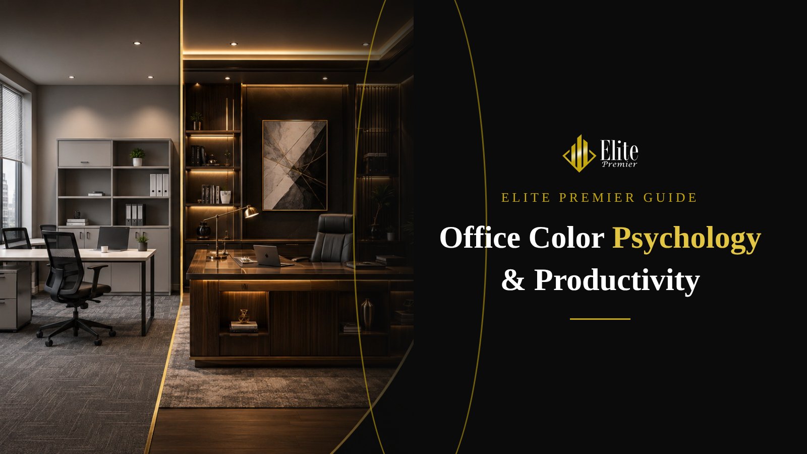
When an employee or client walks into your office, the first thing they register is not the chair model or the desk size but the colors. Color shapes first impressions and influences mood, energy and focus throughout the day. Yet in many companies, office colors are chosen by chance or by one decision-maker’s taste. This guide explains how to choose office colors deliberately, so they support productivity, express your brand and work with your walls, furniture and floors.
- How each color tends to affect mood and focus at work.
- The best colors for open-plan areas, executive offices, meeting rooms, reception and break areas.
- The 60-30-10 rule for balanced color distribution.
- How to bring brand colors into the office without overdoing it.
- Common office color mistakes and how to avoid them.
Why office colors matter
Employees spend roughly a third of their day at the office, and everything around them during those hours affects them directly or indirectly. Color is one of the strongest of these influences because it is everywhere: walls, floors, furniture, partitions and even small accessories. That is why office color design is a core part of any professional office design project, not a final cosmetic touch.
The right color choices achieve three goals at once: they support the type of work done in each area (focus, collaboration, recovery), they communicate your identity to clients and visitors, and they create a comfortable environment people want to stay in. Random choices, on the other hand, can produce an office that is visually tiring, cold and dull, or at odds with the furniture you invested in.
Color does not change the nature of the work, but it changes how people feel while doing it.
How colors influence mood and productivity
Each color carries associations that most people share. These associations are not strict rules; they change with shade, quantity and lighting. But they give you a solid starting point:
🔵
Blue
Associated with calm, trust and mental focus. Suits analytical and long desk-based work; use soft shades rather than very dark ones.
🟢
Green
Linked to nature and balance and easy on the eyes. Works well in open-plan and break areas, especially combined with indoor plants.
🟡
Yellow and gold
Suggests energy, optimism and luxury. Use in measured amounts in furniture accents or creative zones, as too much can be tiring.
🔴
Red
A strong color that raises energy and urgency. Best as a small accent in circulation or brand areas, not in long-focus spaces.
⚪
White and light grey
Create a sense of space and cleanliness. Ideal as a base, but without warm touches they make an office feel cold.
🟤
Wood tones and beige
Add warmth and a refined feel, pairing naturally with wooden furniture, executive offices and reception areas.
Remember that one color can feel very different depending on its shade: pale sky blue is not navy, and olive green is not neon green. For large surfaces, choose calm, mid-saturation shades and keep strong colors for small areas and accents.
The best office colors for each area
A modern office is not one space but a set of zones with different functions. A common mistake is painting the whole office one color. A better approach is a single company palette whose proportions and shades change with the purpose of each zone:
Open-plan workstations
Open work areas need colors that help concentration and reduce visual fatigue during long hours. Light neutrals with touches of calm blue or green are a safe choice. Workstation screens and partitions are a good, organised way to introduce your brand color.
Executive offices
Executive offices should express seriousness and confidence. Deep, refined tones such as navy and charcoal paired with natural wood and gold or brass accents give the space presence without being loud.
Meeting rooms
In meeting rooms people need focus and constructive discussion. Neutral colors with one feature wall in a brand color or wood finish strike a good balance. Avoid very strong colors behind the screen or behind the chair at the head of the table, as they distract.
Reception
Reception is your company’s business card, so this is where brand colors are most justified: a counter in a distinctive color or material, the logo on a considered backdrop and lighting that highlights the details.
Break areas and pantries
These spaces exist to change the rhythm and restore energy, so they can be bolder: warm colors, natural green, wood and cheerful fabrics. A space with a different character helps people separate work time from rest time.
| Area | Suggested colors | Goal |
|---|---|---|
| Open-plan workstations | Warm white, light grey, calm blue or green | Focus and less visual fatigue |
| Executive offices | Navy, charcoal, natural wood, gold accents | Confidence, presence, luxury |
| Meeting rooms | Neutral with a brand-color feature wall | Focused, calm discussion |
| Reception | Brand colors with premium materials | A strong first impression |
| Break areas | Warm tones, green, wood | Relaxation and recovery |
| Focus rooms and phone booths | Calm, slightly deeper tones | Mental separation and quiet |
The 60-30-10 rule for office colors
One of the simplest ways to keep an office palette coherent is the 60-30-10 rule used in interior design:
60% dominant color
Covers most of the space: large walls, ceilings and sometimes floors. Usually a light neutral such as warm white, beige or light grey.
30% secondary color
Appears in large furniture, partitions and some walls or floors. Often a wood tone or a calm color from your brand palette.
10% accent color
Used for details: selected chairs, cushions, frames, lighting or a small wall. This is where your strong brand color appears without overwhelming the space.
This rule prevents the most common problem we see: several competing strong colors that make an office tiring and distracting. It also simplifies furniture selection, because you know in advance which colors belong on large pieces and which on small ones.
💡 Elite tip: When we design your office, we prepare a material board that brings wall, surface and fabric samples together before production, so you see the real combination instead of relying on a screen.
Bringing your brand into the office
Many companies apply logo colors literally to every wall. Brand colors are designed for screens and print and can be overpowering on large surfaces. Use them intelligently:
- Use the main brand color as the 10% accent in reception, the main meeting room and selected furniture.
- Choose softer shades of brand colors for larger areas if you want a broader presence.
- Express the brand through materials too: dark or light wood, gold or black metal, clear or frosted glass.
- Repeat the accent color in deliberate places rather than scattering it.
- Do not forget furniture: chair, partition and storage-front colors are a large part of the final picture.
In our office furniture execution projects we select surface and fabric colors together with wall and brand colors at design stage, because changing furniture colors after manufacturing is costly.
Office colors by type of business
Different businesses have different needs, so no single palette suits everyone. A few examples:
🏦
Finance and legal firms
Need an impression of trust and stability: refined neutrals, navy and dark wood, with few bright colors.
💡
Tech and creative companies
Can use bolder colors in collaboration zones while keeping calm focus areas for deep work.
🏥
Clinics and medical centres
Prefer calm, warm tones that reduce stress, avoiding all-white interiors. See clinic furniture.
🏛️
Government entities
Suit formal, calm colors with the entity’s identity highlighted in reception and meeting rooms.
Colors also change how big a room feels without any construction work. Light colors reflect light and make rooms feel larger, dark colors bring walls visually closer, a light ceiling makes a room feel taller and continuous flooring makes small spaces feel wider. These tricks are especially useful in small offices, as explained in our guide to small office design.
Coordinating walls, furniture and floors
Color never works alone; it reacts with everything around it. Think about three layers together:
- Floors set the visual base. Dark floors feel luxurious but show dust; light floors open up the space but need more care.
- Furniture covers much of the view. Natural wood suits most palettes, while white surfaces need warm touches around them.
- Walls come last to tie floors and furniture together, and they are the easiest layer to change.
That is why we recommend choosing furniture and floors first and then wall colors that suit them. See our guide to office furniture materials to understand how materials affect the final color.
Lighting changes everything
The color you see in a paint catalogue can look completely different on your office wall, mainly because of lighting. Cool light pushes colors towards blue and makes them sharper; warm light pushes them towards yellow and softens them. Daylight also changes through the day and changes the feel of the room with it.
Always test colors on site, under the actual lighting and at different times of day. Learn more in our office lighting design guide.
Common office color mistakes
- Choosing colors on screen only: screen colors differ from reality. Ask for physical samples.
- Too much cold white: it makes an office feel like a clinic or warehouse. Add wood, fabrics and warm accents.
- Too many strong colors: more than one or two accents in the same space creates visual chaos.
- Ignoring the type of work: an accounting office is not a creative agency; choose what your team needs.
- Forgetting maintenance: very light colors in high-traffic areas get dirty quickly.
- Separating color and furniture decisions: leads to expensive mismatches that are hard to fix later.
Office colors in Saudi Arabia: special considerations
In the Kingdom, daylight is strong for most of the year, so very light colors in offices with large glazed facades can look glaring. Medium, warm shades combined with blinds or glare-reducing film work better. Many Saudi companies also favour a refined look that combines natural wood with neutral colors and gold accents, a style that feels premium without being excessive.
In government and institutional offices, calm and formal colors are usually the best choice, with the entity’s identity highlighted in reception and meeting rooms. Learn about our government office furniture service.
Practical steps to choose your office colors
Define the work
Does your team need deep focus, constant collaboration or both?
Collect brand elements
Logo, official colors and the impression you want clients to feel.
Start with furniture and floors
Choose the main materials before wall colors.
Apply 60-30-10
Distribute dominant, secondary and accent colors.
Test samples on site
Under real lighting at different times.
Work with one team
So design, furniture and colors match from the start.
Conclusion: color is a design decision, not personal taste
Choosing office colors affects everyone who enters the space every day. Start from the work done in each area, apply the 60-30-10 rule, coordinate with furniture, floors and lighting and test on site before committing. The result is a comfortable, coherent office that reflects your brand and supports your team for years.
Want a coordinated color and furniture scheme for your office?
We design your office end to end and manufacture furniture in the approved colors and materials in our Jeddah factory.
Frequently asked questions
What is the best office color for focus?
Calm colors such as soft blue, muted green and warm neutrals suit focus areas best; avoid strong colors on the wall directly facing employees.
Is white a good office color?
Yes, as a base color that opens up the space, but prefer warm white and add wood, fabrics and color accents so the office does not feel cold.
How should I use brand colors in the office?
Use them as a small accent in reception, the main meeting room and selected furniture, and choose softer shades for large areas.
Which colors suit executive offices?
Navy and charcoal with natural wood and gold or brass accents give an executive office a refined, calm presence.
Does furniture color affect wall color choice?
Yes. Furniture covers much of the view, so choose furniture and floor colors first and then walls that suit them.
Do you design office colors together with furniture?
Yes. Our office design service includes a full color and material board, and we manufacture the furniture in the approved finishes in Jeddah.